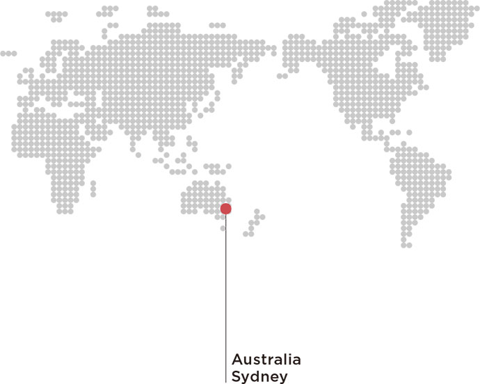
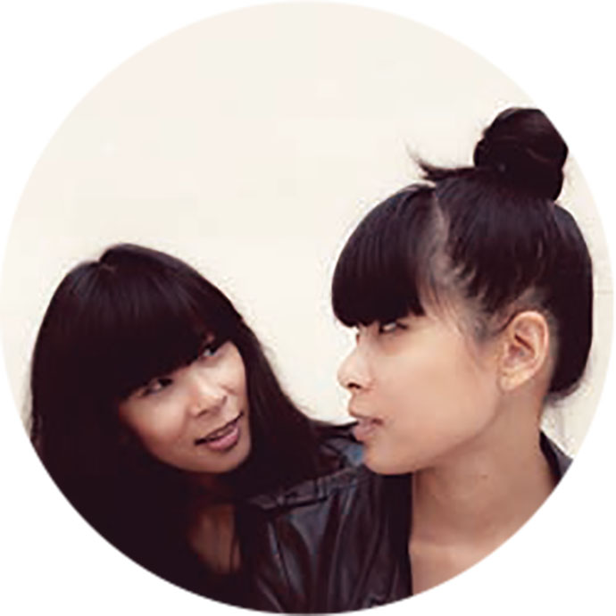
ブレーンのカバーを飾るのは、世界の先端を行くクリエイターたちの作品。「BRAIN’S BRAIN」では、「HAPPY CREATION」をテーマに彼らが制作したビジュアルとオフィスや仕事を紹介していきます。今月の表紙を飾ってくれたのは、オーストラリア シドニーを拠点とするMaricorとMaricar。姉妹で作品をつくっています。
――表紙のアイデアについて教えてください。
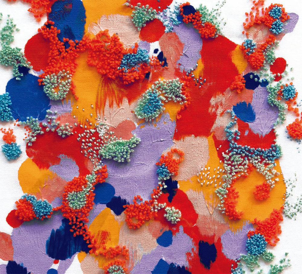
私たちは、表紙のデザインを行う上で2つの要素を大事にしました。一つは色、もう一つはテクスチャーです。
私たちは実験や遊びの中で、インスピレーションやエネルギーを得ることが多く、今回の作品もそうした中から生まれてきたものです。異なる素材を使って、新しい技術を試しながら、新しいものを発見するのは楽しいです。この表紙ではペインティングと刺繍を組み合わせていますが、これは今後、ぜひ試したいと考えている表現です。今回の制作は私たちにとっても新たな取り組みになりました。
――そのアイデアはどのように生まれましたか。
大胆で強烈な色の爆発を起こしてみたいと思いながら、この表紙をつくりました。色のテクスチャーの上にパンチワークという技術を使い、抽象的で立体的な刺繍を施しています。私たちにとって実験的な取り組みです。
――日本の広告とデザインをどう思いますか。
日本の文化は、視覚的なものが豊富です。日本は、伝統、また一方でアヴァンギャルドなビジュアルに加え、アーティザンシップへの理解が深いと思います。
Maricor/Maricar
Q1. What is the idea for this cover?and how did you make it?
We wanted to focus on colour and texture which are two elements that are very important to our design and embroidery work. We gain creative inspiration and energy from experimentation and play so these were also themes we wanted to explore for the cover artwork. Testing out new techniques and being open to using different materials and seeing how these develop is an exciting process. For this cover we combined embroidery and painting which is a new direction for our design and embroidery work that we look forward to experimenting with in the future.
Q2. What made you come up with the idea?
We wanted the cover to be an explosion of colour and be vibrant and bold. Recently we were introduced to a different embroidery technique called punchwork and wanted to explore creating abstract embroidery with these stitches on top of painted colour textures.
Q3. What do you think of Japanese advertisement and design?
Japan has a rich visual culture. It’s an exciting mix of tradition, avant garde aesthetics and an appreciation of materials and artisanship.
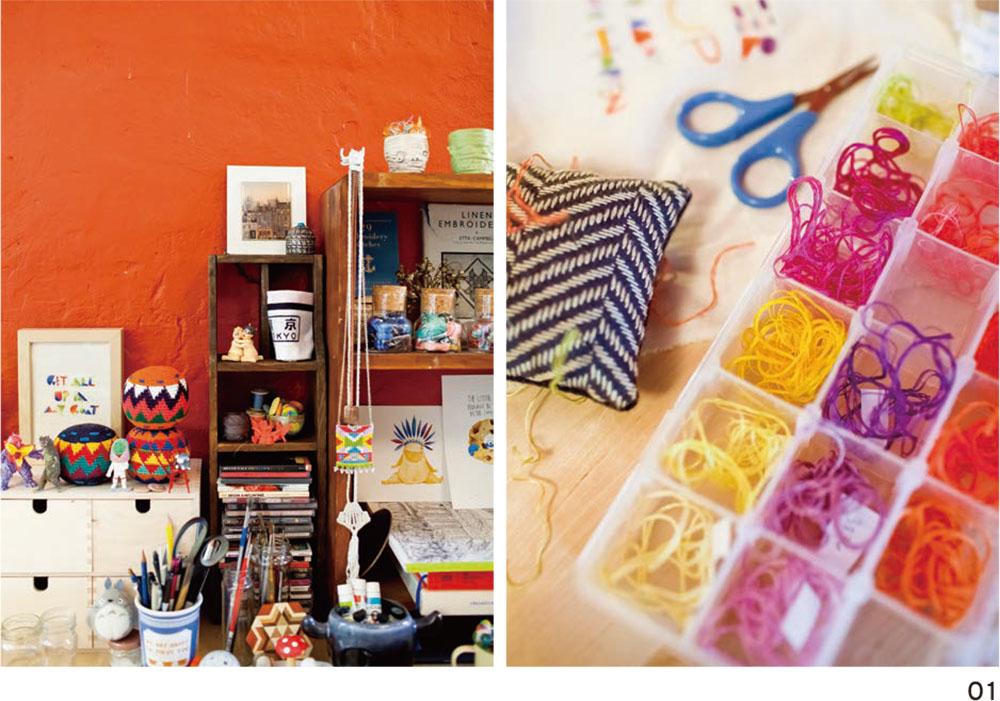
01 Maricor/Maricarのアトリエ
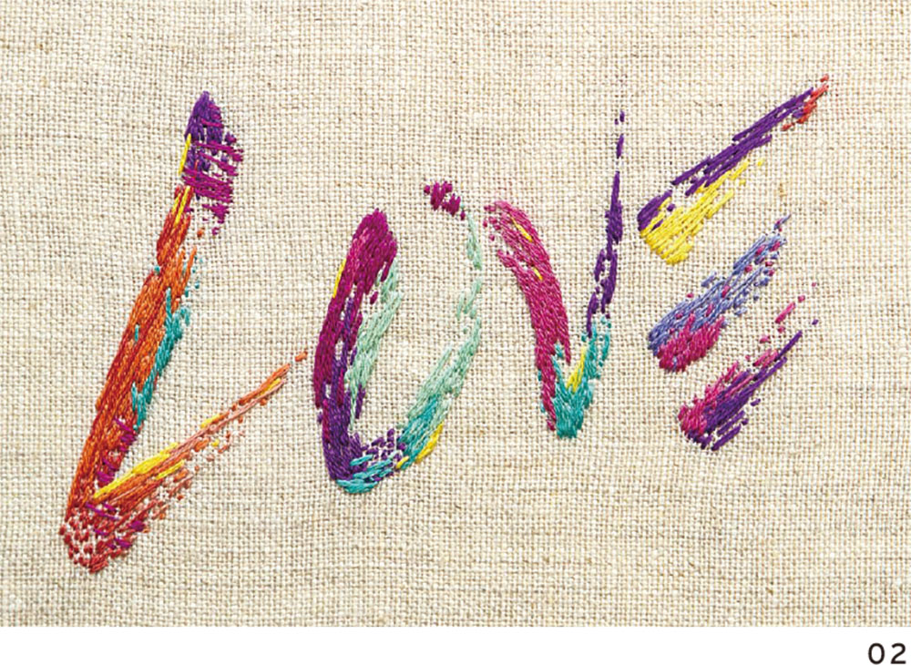
02 「LOVE」(個人的な依頼で制作)
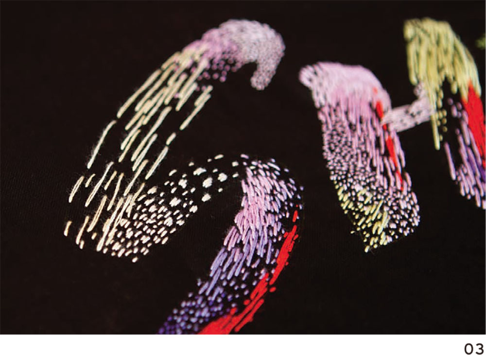
03 「SHUT UP I'M DREAMING」(Hoopla group exhibition)
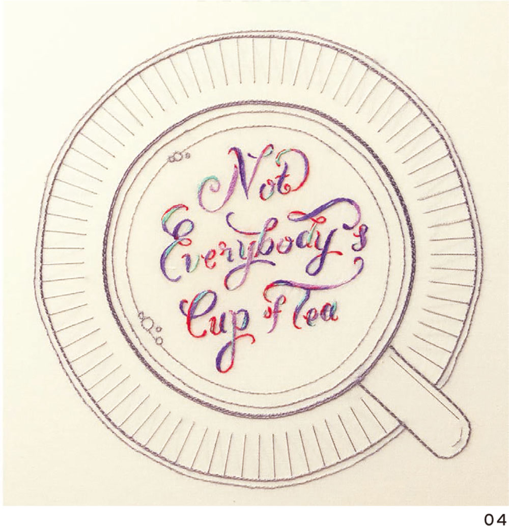
04 「WASHINGTON POST」(Not everybody's cup of tea)
Maricor/Maricar
デザインとイラストレーションのクリエイティブチーム。手作りの刺繍や手触りのグラフィックデザインを制作。イラストレーションやアニメーションの作品は、彼女たちの地元であるオーストラリアを初めとして世界中で展示されている。オーストラリアのブリティッシュ・カウンシルRYD賞、NYのアートディレクターズクラブYoung Guns Awardを受賞。